Cover Reveal for THE SERPENT KING
C-O-V-E-R R-E-V-E-A-L D-A-Y!!
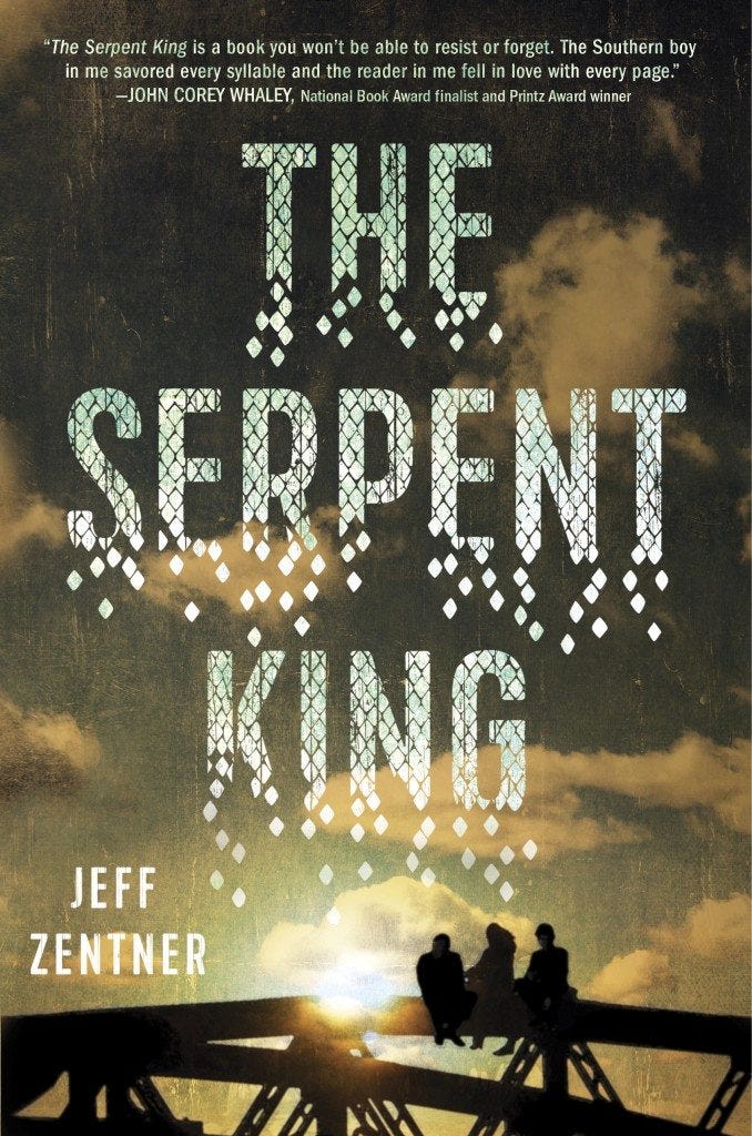
Today we have the honor of revealing the cover for THE SERPENT KING by Jeff Zentner, forthcoming from Random House on March 8th, 2016. Jeff is a really cool guy and I was so excited when his book sold, and while book deals are crazy exciting and life changing, I was REALLY pumped when Jeff messaged me with the beauty we're revealing today. Once you manage to pull yourself away from this arresting cover be sure to continue scrolling to learn more about the book, Jeff's thoughts on the cover, an insightful look into the cover process between Jeff's editor Emily Easton and cover designer Alison Impey, how you can win 1 of 5 arcs, and a high-five from yours truly. HERE'S THE COVER! Isn't it glorious?

Dill has had to wrestle with vipers his whole life—at home, as the only son of a Pentecostal minister who urges him to handle poisonous rattlesnakes, and at school, as he faces down bullies who target him for his father's extreme faith and his very public fall from grace. The only antidote to all this venom is his friendship with fellow outcasts Travis and Lydia . But as they are starting their senior year, Dill feels the coils of his future tightening around him. The end of high school will lead to new beginnings for Lydia, whose edgy fashion blog is her ticket out of their rural Tennessee town. And Travis is happy wherever he is thanks to his obsession with the epic book series Bloodfall and the fangirl who may be turning his harsh reality into real-life fantasy. But Dill's only escape is his music and his secret feelings for Lydia—neither of which he is brave enough to share. Graduation feels more like an ending to Dill than a beginning. But even before then, Dill must cope with another ending—one which will rock his life to the core. Debut novelist Jeff Zentner provides an unblinking and, at times, comic view of the hard realities of growing up in the Bible belt, and an intimate look at the struggles to find one’s true self in the wreckage of the past.
Jeff's Thoughts About the Cover

ADAM SILVERA: Jeff! Dude. I’m obsessed with this cover. The scaly font is pretty baller and the tone has this cross appeal vibe for both the YA and adult markets. I would’ve cried happy tears to find this attachment in my “Book Cover!” email. But this is YOUR cover so tell me how YOU feel. JEFF ZENTNER: Let me tell you how I feel about this cover. If Crown had given me money to hire a designer and do anything I wanted, I might have come up with something I love half as much as this cover. Not only is the cover beautiful, the book has a gorgeous velvet matte finish that you just want to roll around on naked. I truly feel fortunate to have a brilliant designer like Alison and a brilliant editor like Emily in my corner.
Creating the Cover
EMILY EASTON (Editor): When you publish a book you have taken to heart and nurtured for so long, it is sometimes difficult to know what to put on the cover to help readers love it as much as you do—or at least to make them pull it off the shelf, which is the first step on the journey toward loving it. With such a richly textured story, there were so many directions we could have gone—and did try—as part of the process. ALISON IMPEY (Cover designer): There was one line in the book that really stuck with me. In English class, Dill is asked what Lord of the Flies is about. He answers, “I guess it’s saying that we’re all born with seeds in us. And if we let them see sunlight and air, they’ll grow through us and break us. Like a tree growing up through a sidewalk.” This inspired a couple early cover concepts. One was a screen-print-style image of a guitar with a tree growing out of it that represented the creative seed in Dill that with a little “sunlight and air” could grow. A second option featured a tree, its branches reaching up through the title, with a snake wrapped tightly around the trunk. We then found the perfect illustrator to help bring these concepts to life. EMILY: We shared these illustrated covers, and while everyone agreed the images were striking, the consensus was that the illustrated approach was making the book look too young for our targeted audience. There was also concern that the symbolic snake pushed the book more in a fantasy direction, while the content is realistic fiction. ALISON: At this stage we agreed to go back to the drawing board. We enlisted a couple of designers to bring as many new ideas to the table as possible. We wanted to make sure no stone went unturned. As new ideas started to roll in, some featuring snakes, we realized that with our title—The Serpent King—we had fallen into the trap of saying and showing the same thing. EMILY: As we moved in a new direction, we were drawn to the idea of showing the main character, Dill, to somehow depict the strength of his inner light, which allowed him to prevail against the darkness that threatened to extinguish it. Dill is really the heart of the story, and we thought putting him front and center could draw readers in. ALISON: It was very helpful for us to regroup and prioritize what we wanted to achieve with the cover. When we started to discuss “triumph” as the main theme and the emotion we wanted to convey, it really helped us break through and refocus. EMILY: We had two cover versions focusing on Dill that we were seriously considering. But there was one image from Alison’s early concepts that we couldn’t forget. It captured the sense of place, the power of friendship that was the saving grace for our three main characters, and the sense of hope that readers are left with by the book’s end. Originally I had passed this image by because I was looking for something either more iconic or more character-driven. But when Alison paired this image with a dynamic type treatment she created, it gave the cover concept a whole new power and interest. ALISON: When we discussed triumph against all odds, I envisioned Dill breaking away and shedding his past. I wanted the title type treatment to represent this, as if the scales of Dill’s past are breaking away, scattering, about to give sun and air to that seed in him. So after a long process and many, many cover concepts, we did in fact land on an image that was in the very first batch of ideas. To some this may feel like the process was all for naught, but it wasn’t, and it rarely ever is. You always discover something new. The type treatment on the final cover is something that evolved through this process, and I am very happy it did. EMILY: When we showed this concept to our team, it was met with a resounding “yes!” We all believe it has just the right appeal to draw in as wide an audience as this special book deserves. Or at least that’s our hope! Thank you so much, Emily and Alison! I’m sure our readers will take away a lot from the insight behind this incredible cover.
HOW TO WIN AN ADVANCE READER'S COPY

If you want a chance to win an advance reader's copy before the book's March 8th, 2016 publication be sure to tweet about this cover reveal or share the cover on Instagram using the #TheSerpentKing hashtag. Jeff Zentner/Random House will select 5 lucky winners on Friday, July 3rd! You can enter multiple times on Twitter or Instagram (or both platforms!) but you must use the #TheSerpentKing hashtag each time. *high five* What do you think of this cover? Would you like to hear from more editors and cover designers in future posts? Let us know in the comments below! :)


