Working with the design team
One of the great things about being an editor of chapter books and middle grade is my relationship with the design team. Because so many of my books are illustrated, I spend a lot of my time working with the designers making sure each book on our list looks fantastic. To give you an inside look into the world of the design department, I’m going to break down the design process for Adam-Troy Castro’s Gustav Gloom and the People Taker, a creepy middle grade book from Grosset & Dunlap that comes out on August 16th.
A bit about the book:
In Hugo Award nominee Adam Troy Castro’s Gustav Gloom series, shadows have lives of their own and can choose to stay with their human or leave them. Gustav Gloom is a sad, young boy who lives in a shadow house, where shadows go when they would rather not be with their humans. Fernie What, Gustav’s new neighbor, finds herself lost in the Gloom mansion after her cat appears to have been chased there by its own shadow. Fernie discovers a library full of every book that was never written, a gallery of statues that are just plain awkward, and attends a dinner where her own shadow takes part in the feast! Along the way Fernie is chased by the People Taker who is determined to take her to the Shadow Country. It's up to Fernie and Gustav to stop the People Taker before he takes Fernie's family.
Finding an illustrator:
When I acquired the Gustav Gloom series, I passed the manuscript to the designer of the book, Christina Quintero, and the two of us discussed what we were looking for. We had a clear idea of what the books should look like. We knew that we wanted to play with the format and do something more than a typical hardcover book and we knew that we needed an illustrator who could create a creepy atmosphere without being too scary. While at a convention last summer, I saw a picture book illustrated by Kristen Margiotta and instantly knew I wanted her to illustrate Gustav. After showing Kristen’s work to Christina, and agreeing that she would be great, Christina approached Kristen about doing some sample illustrations for us to show our team in-house. Kristen read the manuscript and sent along character sketches showing us how she envisioned the characters.

Gustav and Fernie sketches
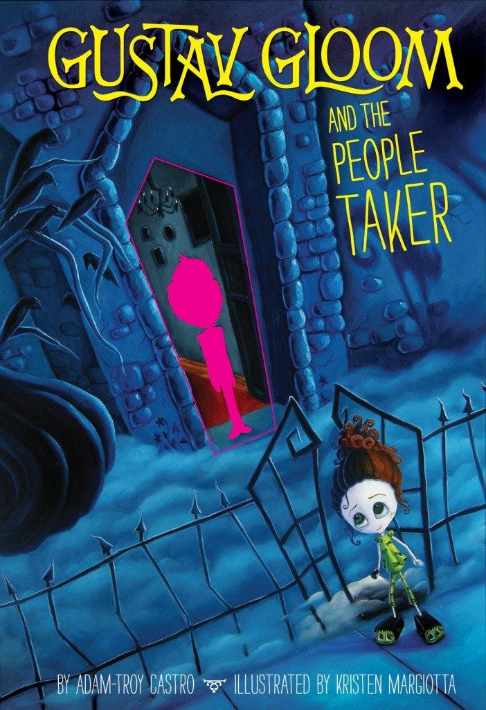
The Cover: Once we found the perfect illustrator for the book, Christina and I sent Kristen a cover concept, a detailed description of what we wanted on the cover. We knew we needed to show Gustav’s house with Gustav in the doorway. We also wanted to show the other main character of the story, Fernie What. We came up with a cover for Gustav Gloom and the People Taker that is unique and accomplishes both these goals because it features a die-cut with a printed shadow of Gustav on the cover. Here is one of Kristen’s thumbnails (Rough sketch) of the cover:

Kristen's thumbnail of the cover After Christina and I got feedback on the thumbnail Kristen had drawn, we had Kristen do a tighter sketch of the cover and Christina got to work on the title treatment. This is the rough cover and title treatment:

Cover sketch with early title treatment Finally, after another round of comments, we gave Kristen the go-ahead to paint the cover. One of the great things about Kristen is that she is a gallery artist and does all of her work in oil paint. Some of my favorite days in the offices are the days when we get paintings in from Kristen.

Me and the painting of the cover Once the painting arrived, Christina was able to show us the final cover design.

The final cover This version of the cover shows where the cutout is on the cover (pink line) and where the printed shadow of Gustav appears (pink). The yellow areas are spot lam areas (so will look a little shiny) while the rest of the cover is matte.

Cover with special effects
Interior Illustrations:
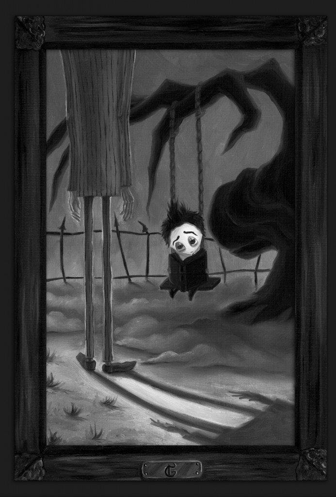
A full page illustration opens every chapter of Gustav Gloom and the People Taker, so in addition to the cover, Christina and I worked with Kristen on the interior illustrations. During my final edit of the manuscript, I wrote art suggestions for each illustration. Christina and I discussed the art suggestions and then sent them along to Kristen. Here is Kristen’s sketch for the first illustration in the book.

Sketch for Chapter 1 Here is the final illustration as it appears in the book.

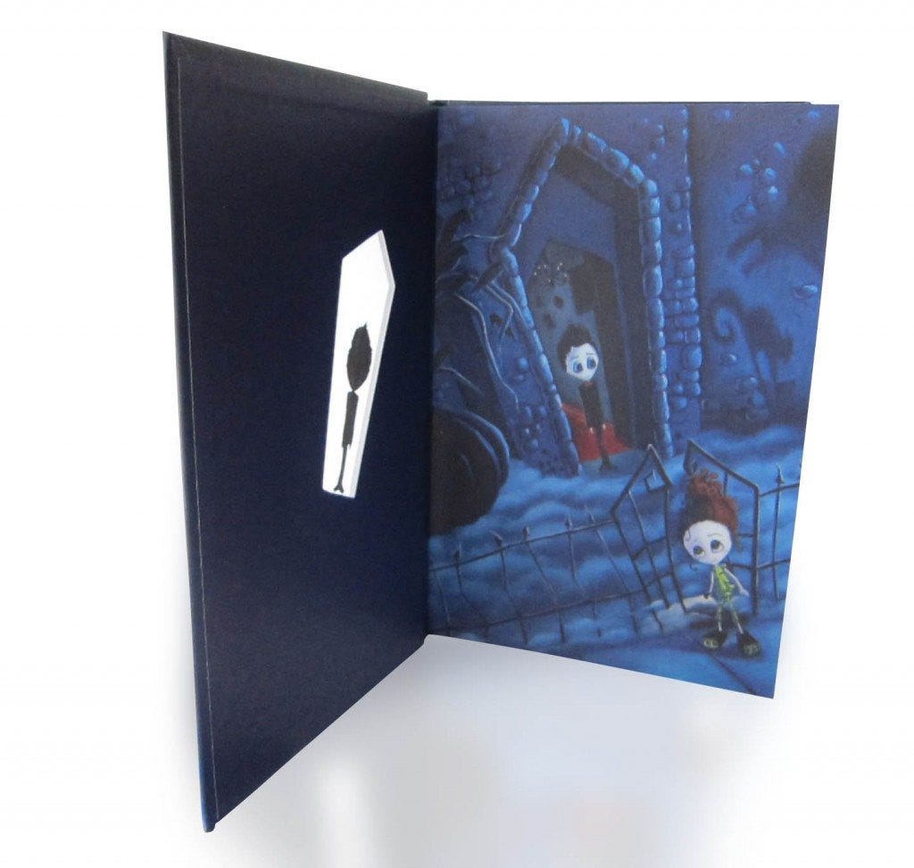
Final painting for Chapter 1 Christina worked closely with Kristen on all of the art for Gustav Gloom and the People Taker and the work the two of them did is fantastically spooky. And here is the final book!

The final book! Check out how Gustav's shadow moves off of him when you open the cover!

The final book opened! Working on the design of this book with Kristen and Christina was so much fun, and we’re already hard at work on the second and third books in the Gustav Gloom series, so I’m looking forward to more beautifully creepy paintings from Kristen Want an early copy of Gustav Gloom and the People Taker? Goodreads is hosting a giveaway of five ARCs. Enter before August 1st! [hr] What are some of your favorite illustrated middle grade books?
