SALT & STORM Cover Reveal! (Plus insights to how the artwork came to be)
Today I (Erin) have a writing friend and agency sibling joining us on the blog. Kendall Kulper has stopped by Pub Crawl before to guest blog, and today she's here to share the absolutely stunning cover for her forthcoming YA debut, Salt & Storm. Because I know you'll likely scroll down anyway, let's get to the goods first...
............
.......
...
.
.
.

GORGEOUS, right? And the official synopsis sounds as awesome as the cover looks:
Sixteen-year-old Avery Roe wants only to take her rightful place as the witch of Prince Island, making the charms that keep the island’s whale men safe and prosperous at sea. But before she could learn how to control her power, her mother, the first Roe woman in centuries to turn her back on magic, stole Avery away from her grandmother. Avery must escape from her mother before her grandmother dies, taking with her the secrets of the Roes’ power. When Avery awakens from a dream foretelling her own murder, she realizes time is running short—for her and for the people of her island, who, without the Roes, will lose their ships and the only life they know. With the help of Tane, a tattooed harpoon boy from the Pacific Islands, Avery plots her escape from her mother and unravels the mysteries of her mother’s and grandmother’s pasts. Becoming a witch may prevent her murder and save her island from ruin, but Avery discovers it will also require a sacrifice she never expected—one she might not be able to make.
As many of you know, the steps between initial comp and final cover are often many. To give us a little more insight on how Salt & Storm's cover came to be, here's author Kendall Kulper: [hr]

I've always been a cover nerd, checking out design websites for the year's best covers and fake-redesigning covers for my favorite books. But I'd heard from countless authors that when it came to covers, it was out of your hands, so I didn't get my hopes up too much that I would have any say in my cover (but I wasn't too worried, since luckily, my publisher, Little, Brown, has an amazing catalog of covers). So color me surprised when I got an email from my editor asking if I had any cover preferences. Um.... DO I?!?! I sent her back a terrifyingly long email containing some of my favorite do's (like hand-lettering) and don'ts (pretty girl in a pretty dress). But one of the things that really helped both of us get on the same page was the tumblr I'd started waaaay back when I was drafting Salt & Storm, when I began collecting the songs, images, paintings, and drawings that captured the feel of Salt & Storm's world.

I created the tumblr, The Old Whaling Island, mostly to keep track of some of the images I was finding. Since SALT & STORM is a historical fantasy set at the end of the golden age of whaling, a lot of the information I found about how people dressed, where they lived, and the kinds of objects they used came from photographs.

These photos were so helpful in my figuring out how the world of SALT & STORM functioned and in nailing down certain character quirks. The photo below, of a young girl from the 1850s, captures the way I think about my main character, Avery: a strong, confident, and straightforward young woman.

{ 1 }
Having a picture like this to show my editor was an easy way for me to argue that a cover of a girl in a pretty dress walking down a beach and looking sad (although it can be beautiful for the right book) would just not work for SALT & STORM. Avery's the kind of character who hates pretty dresses and it's her darkest moments that make her the most determined.

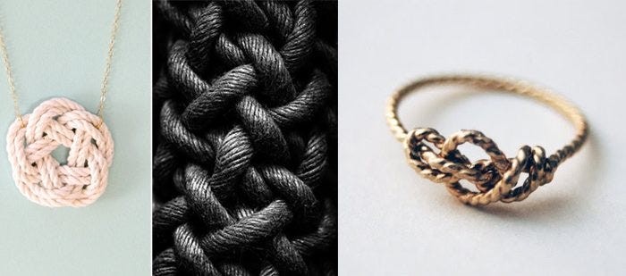
When I started pulling images from the tumblr to share with my editor, I went to the ones that captured the feeling—more than the literal look—of Salt & Storm. These were the pictures that jumped out at me and inspired me and reflected the energy and mood of the story. A few months after emailing these pictures, my editor showed me some of the cover comps they'd come up with, and I was stunned at how beautifully they were able to channel the kind of dark, subtle look I'd had in my head. But, the designer said, they wanted something more, something that would add a human element, something that would stand out and look iconic. We talked about designing a magical charm, since a huge part of the story concerns the island witches crafting good luck charms for sailors, but I kept going back to the image of rope.

Rope is hugely important in SALT & STORM. It's used in one of the first spells Avery learns, which is one of the reader's very first introductions to the kind of magic her family creates. It's also important to the island's sailors, since ropes and riggings are, essentially, the veins of a ship. And it evokes ties, connections, and bonds, especially familial bonds, which Avery struggles with throughout the course of the story. Plus, it's just plain pretty. With that in mind, I sent off some of my favorite images of ropes. And when I finally saw the cover...I knew they had nailed it. The colors, (hand-lettered!!!) words fading in and out of the watery background, and that beautiful rope, beginning with a Celtic heart knot and ending frayed (but not broken). I love it, and I can't imagine anything more perfect! [hr]

I (Erin) couldn't agree more! A huge thanks to Kendall for giving us a peek at her cover's design process, and for sharing some of the images that inspired the artwork. I'm so glad it was a collaborative effort between author and publisher, because I absolutely adore the final result. Keeping in the whaling, ocean-centric theme, Kendall is offering up some Salt & Storm swag. Two winners will receive a handcrafted, wooden whale pen (shown at right).
To enter, just fill out the rafflecopter widget below and share your cover reactions in the comments! Giveaway is open US only, and we'll announce the winners next week. In the meantime, perhaps you'd like to add SALT & STORM to your goodreads shelf.

